A Question of Tone

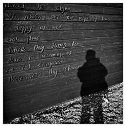
Okay, so this is an old picture to illustrate a problem. I've been making the prints for the Edinburgh exhibition and getting a bit dismayed at how much better (and different) they look compared to the versions on the web. Partly this is the inevitable difference between looking at a nice 12x12 and a small jpeg on a screen, but it's also to do with reproducing tone properly - in fact, up to now, without being able to make and scan prints of every picture, I haven't really attempted it, and all b&w images on my site are just grayscales.
(And lets not even get started on the fact that not many people ever calibrate their monitors, and the same image can look hugely different on someone else's computer...)
Anyway, the above is my attempt to recreate the look and tone of the actual print in photoshop - and here is the original untoned grayscale version for comparison. What do you all think? Is it worth the extra effort to try and reproduce the look of the print on screen, or are grayscales sufficient given the limitations of web viewing?


